Making Web Components accessible
February 8, 2022
Series: Working with Web Components
Last week, I set out to make a stylable and accessible replacement for the default <select> element. This started out from me building a custom date-picker for an app, and I wanted to create a standard that I could reuse.
I've lost count of the number of times I've created custom designed dropdowns over the years - and I'm also pretty sure that most of them fell short on accessibility, I'm sorry to say.
Stylable (or at least stylish) select boxes or dropdowns, or anything that seeks to replace the default and obstinate form elements, are also ten-a-penny. It also seems that most of them are bad at accessibility, too.
So why do this all over again? I think it is possible to get the accessibility right, without overcomplicating how the component is used in code. Another motivation is that I wanted to finally have a go at a pure vanilla Web Component - all my work with components so far has been within the Vue framework.
Resources
Before getting too far in, I did the reading. There's quite a few places which provide good background and examples for Web Components:
For the accessibility side of things, particularly with a select/dropdown component, these were my starting points:
I'll bring up other references as they become relevant.
Build-tools
Since this is vanilla JavaScript, you don't actually need any build tools - you could just write a html document and load it in the browser and the code we'll write below will work.
However, to make life a little easier I used the Web Dev Server from Modern Web which can watch for file changes and automatically refresh the browser.
Design
There were three main requirements I wanted to fulfil with this component:
- Make it stylable
- Make it accessible
- Provide a good development experience (DX)
The first two are self-explanatory, but what do I mean by a good development experience?
Consider how <select> elements are written:
<form>
    <label for="manufacturer">Choose a manufacturer</label>
    <select id="manufacturer">
        <option selected>Ford</option>
        <option>Holden</option>
    </select>
</form>
I wanted people using my component to be able to follow the same pattern.
<form>
    <label for="manufacturer">Choose a manufacturer</label>
    <dropdown id="manufacturer">
        <option selected>Ford</option>
        <option>Holden</option>
    </dropdown>
</form>
First hurdle: Web Components must be hyphenated
I started simple:
<script>
    class Dropdown extends HTMLElement {
        constructor() {
            super();

            this.attachShadow({ mode: 'open' });
        }
    }

    customElements.define('dropdown', Dropdown);
</script>

<form>
    <label for="manufacturer">Choose a manufacturer</label>
    <dropdown id="manufacturer">
        <option selected>Ford</option>
        <option>Holden</option>
    </dropdown>
</form>
Result:
Failed to execute 'define' on 'CustomElementRegistry': "dropdown" is not a valid custom element nameI'd forgotten that custom elements names require a dash. This makes sense - it differentiates custom elements from standard ones, and prevents collision with potential future elements. There are a couple more restrictions and caveats, but dropdown-selector would be a reasonable name.
I also renamed the class to DropdownSelector - this isn't strictly necessary, but it makes it easy to match with the element.
After renaming the element, we can load the document and see that our options are missing. This is because the browser has swapped the contents of <dropdown-selector> with the contents of our custom element's Shadow DOM. Since the Shadow DOM is empty, nothing gets rendered here.
Creating a template for our accessible template to be styled
In order to be able to style the select and options, we can do something like this:
<div class="select">
    <div class="option"></div>
</div>
However, this immediately removes all semantic meaning for the user, and also loses the inherent behaviour that browsers afford <select> elements. So we'll have to provide the necessary meaning and behaviour this within our component. Luckily, the ARIA Authoring Practices provide an example dropdown pattern.
If we were to do this without a component, we would do something like this in our form:
<label id="manufacturer-label">Choose a manufacturer</label>
<div class="select">
<div id="manufacturer-combo"
class="combo"
role="combobox"
tabindex="0"
aria-controls="manufacturer-list"
aria-expanded="false"
aria-haspopup="listbox"
aria-labelledby="manufacturer-label"
/>
<div id="manufacturer-list"
class="options"
role="listbox"
tabindex="-1"
aria-labelledby="manufacturer-label"
>
<div class="option" id="manufacturer-option-0">Ford</div>
<div class="option" id="manufacturer-option-1">Holden</div>
</div>
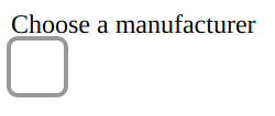
</div>To get started on a component-based solution, we'll replace the content of the page's body with this:
<script></script>
<form>
<label for="manufacturer">Choose a manufacturer</label>
<dropdown-selector id="manufacturer">
<option selected>Ford</option>
<option>Holden</option>
</dropdown-selector>
</form>Now we should be seeing something like this:
We need to address the label
The label is a problem. It's sitting outside of our component, because we're trying to maintain the usual label/select pattern with our custom element. However, there's a fairly clear delineation between the Shadow DOM inside our component and the main document outside. This means that there's no relationship between that label and the component.
For mouse users, if you click on the label - nothing happens. Even worse, if you are using a screenreader and use the tab key to set the dropdown as the active element, the label is not read out and even announce the function of the dropdown incorrectly, creating obvious confusion.
I resolved this problem by having my component look for a label and pull it in:
class DropdownSelector extends HTMLElement {
  constructor() {
    super();

    this.attachShadow({ mode: 'open' });

    this.shadowRoot.innerHTML = html;

    this.__parentLabel = document.getElementById(this.getAttribute('aria-labelledby'));
    this.__label = this.shadowRoot.getElementById('label');

    this.__label.innerHTML = this.__parentLabel.innerHTML;
  }
}
This solution does mean we can't use the for attribute on original label, so we need to change our HTML a little:
<label id="manufacturers-label">Choose a manufacturer</label>
<dropdown-selector aria-labelledby="manufacturers-label">
    ...
</dropdown-selector>
Unfortunately, this will produce an error, but this can be resolved by specifying our script as a module:
<script type="module">
    ...
</script>
This allows our class to access the attributes on the original dropdown-selector and pull in the label.
I wish I knew why this is the case - simply setting the script to defer (which is implicit in using the module type) doesn't seem to work. However, the type="module" attribute is required when it comes time to extract the code into an external script that can be imported by the browser.
Now that we have this working, we should be seeing double labels:
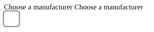
We don't want to force developers to create special rules for the labels they're associating with our component. However, our label needs to be 'visible' to allow screenreaders to associate it with the combobox and listbox elements in our component, so we can't simply use display: hidden. So, in our component styles we can just fling it off to the side somewhere:
    label {
        position: absolute;
        left: -1000px;
    }
Developers using our component can now consistently style the original label to match their other labels. Screenreaders will ignore the original label, since it doesn't relate to anything - and they will use the one we have inside our component to correctly announce the label and component's function when focus is given.
However, we have one more thing to do - since there is still no functional relationship between the original label and our component, clicking on the label won't activate the component like we expect with other label/input pairings.
We can compensate for this from within our component:
class DropdownSelector extends HTMLElement {
constructor() {
...
}
connectedCallback() {
if (this.isConnected) {
if (this.__parentLabel) {
this.__label.textContent = this.__parentLabel.textContent;
this.__parentLabel.addEventListener('click', this.click.bind(this));
}
}
}
disconnectedCallback() {
if (this.__parentLabel) {
this.__parentLabel.removeEventListener('click', this.click.bind(this));
}
}
click(event) {
this.shadowRoot.getElementById('combo').focus();
}
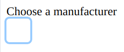
}And if we add a little style to the combobox, we can see it happening:
    .combo:focus {
        outline: 3px solid #99ccff;
        border-radius: 0.25em;
        padding: 1em;
    }
It's good to have options
Now that users can access our component, we need to provide them the options. We need to consider the following standard behaviour for <option> elements:
- they have an optional value attribute. If this is unset, the option's value is based on it's text content;
- and they have an optional selected attribute. In a dropdown context, there should only be one such element.
First, we need to get the list of options defined in the original HTML, and then render the options within our component.
class DropdownSelector extends HTMLElement {
  constructor() {
    super();

  ...

    this.__listbox =

      this.options = [...this.querySelectorAll('option')].map((option, index) => {
        return {
          label: option.textContent,
          selected: option.hasAttribute('selected'),
          value: option.getAttribute('value') ?? option.textContent,
        }
      });
  }
}
We'll now see our options listed. We could hide them until the dropdown has focus, using display: hidden. However, a feature of <select> inputs is that they default to a width that fits its content. If we simply hide the options, then our dropdown will default to fit the content that remains visible (that is, the selected option), but will resize to fit the longest available option when opened.
To avoid this, we'll just use some overflow magic:
    .options {
        height: 0;
        overflow-y: hidden;
        position: relative;
        background-color: #fafafa;
    }

    .combo[aria-expanded=true] ~ .options {
        height: auto;
        outline: 3px solid #999999;
        border-radius: 0.25em;
    }
Even though the content is technically visible, screenreaders won't see the content in the list until we inform them that the list is expanded by updating the relevant aria attributes. To make our dropdown behave more like a standard select element, we need to manage the open/close status of the list:
constructor()
{
...
this.__combobox = this.shadowRoot.getElementById('combo');
}
connectedCallback() {
if (this.isConnected) {
...
this.__combobox.addEventListener('blur', this.blur.bind(this));
this.__combobox.addEventListener('click', this.click.bind(this));
}
}
disconnectedCallback() {
...
this.__combobox.removeEventListener('blur', this.blur.bind(this));
this.__combobox.removeEventListener('click', this.click.bind(this));
}
blur(event) {
this.closeList();
}
click(event) {
this.open ? this.closeList() : this.openList();
}
closeList() {
this.open = false;
this.__combobox.setAttribute('aria-expanded', 'false');
this.__combobox.setAttribute('aria-activedescendant', '');
this.__combobox.focus();
}
openList() {
this.open = true;
this.__combobox.setAttribute('aria-expanded', 'true');
this.currentIndex = this.selectedIndex;
this.__combobox.setAttribute('aria-activedescendant', `option-${this.currentIndex}`);
const options = this.__listbox.querySelectorAll('[role=option]');
[...options].forEach((option) => {
option.classList.remove('current');
});
options[this.currentIndex].classList.add('current');
this.__combobox.focus();
}
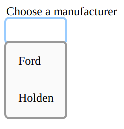
}Now we've added the list, we can provide a little bit more styling:
  .option {
    padding: 1em;
  }

  .option.current {
    outline: 2px solid #acdcfc;
    background-color: #f0f0f0;
  }

  .option:hover {
    background-color: #acdcfc;
  }
When we click on the combo box, we should now see the styled list of options:
Setting the value
Initial selection
By default, when a <select> is displayed it shows the text for whichever <option> element has a selected attributed. If none of the options have been selected, the <select> shows the text for the first option.
  constructor() {
    ...

    if (this.selectedIndex === null) {
      this.selectedIndex = 0;
    }

    if (this.options[0]) {
      this.__combobox.textContent = this.options[this.selectedIndex].label
      this.value = this.options[this.selectedIndex].value;
    }
  }
When a user selects an option
We need to update the selection whenever a user selects an option. However, if the user is clicking with a mouse, the browser will also detect a mousedown event, which causes the combobox to lose focus and trigger the blur event handler we wrote which closes the list, and this will interfere with the selection.
To get around this, we'll use a flag which allows us to ignore the blur event when we need to:
  connectedCallback() {
    [...this.__listbox.children].forEach((element, index) => {
      element.addEventListener('click', (event) => {
        event.stopPropagation();
        this.select(index);
        this.click(event);
      });
      element.addEventListener('mousedown', this.setIgnoreBlur.bind(this));
    });
  }

  blur(event) {
    if (this.ignoreBlur) {
      this.ignoreBlur = false;
      return;
    }

    this.closeList();
  }

  select(index) {
    this.currentIndex = index;
    this.selectedIndex = index;

    this.value = this.options[index].value;
    this.__combobox.textContent = this.options[index].label;

    const options = this.__listbox.querySelectorAll('[role=option]');
    [...options].forEach((option) => {
      option.setAttribute('aria-selected', 'false');
    });
    options[index].setAttribute('aria-selected', 'true');
  }
Keyboard events
Without reacting to keyboard events, we don't have a fully accessible component.
The ARIA ComboBox Example is a great resource for how the component should react to various keyboard events.
We need to listen for a keydown event, and then determine what action to take:
const Actions = {
  Open: 0,
  Close: 1,
  Up: 2,
  Down: 3,
  PageUp: 4,
  PageDown: 5,
  First: 7,
  Last: 8,
  Select: 9,
  SelectAndClose: 10,
};

class DropdownSelector extends HTMLElement {
  connectedCallback() {
    ...

    this.__combobox.addEventListener('keydown', this.keydown.bind(this));
  }

  ...

  keydown(event) {
    const action = this.actionFromKey(event);

    switch (action) {
      case Actions.First:
      case Actions.Last:
        this.openList();
      // intentional fallthrough
      case Actions.Up:
      case Actions.Down:
      case Actions.PageUp:
      case Actions.PageDown:
        event.preventDefault();
        this.updateCurrentIndex(action);
        this.refreshList();
        break;
      case Actions.SelectAndClose:
        event.preventDefault();
        this.select(this.currentIndex);
      // intentional fallthrough
      case Actions.Close:
        event.preventDefault();
        this.closeList();
        return;
      case Actions.Open:
        event.preventDefault();
        this.openList();
        return;
    }
  }

  actionFromKey(event) {
    const {key, altKey, ctrlKey, metaKey} = event;
    const openKeys = ['ArrowDown', 'ArrowUp', 'Enter', ' ']; // all keys that will do the default open action
    // handle opening when closed
    if (!this.open && openKeys.includes(key)) {
      return Actions.Open;
    }

    // home and end move the selected option when open or closed
    if (key === 'Home') {
      return Actions.First;
    }
    if (key === 'End') {
      return Actions.Last;
    }

    if (this.open) {
      if (key === 'ArrowUp' && altKey) {
        return Actions.SelectAndClose;
      } else if (key === 'ArrowDown' && !altKey) {
        return Actions.Down;
      } else if (key === 'ArrowUp') {
        return Actions.Up;
      } else if (key === 'PageUp') {
        return Actions.PageUp;
      } else if (key === 'PageDown') {
        return Actions.PageDown;
      } else if (key === 'Escape') {
        return Actions.Close;
      } else  if (key === 'Enter' || key === ' ') {
        return Actions.SelectAndClose;
      }
    }
  }

  updateCurrentIndex(action) {
    const max = this.options.length - 1;

    switch (action) {
      case Actions.Up:
        this.currentIndex -= 1;
        break;
      case Actions.Down:
        this.currentIndex += 1;
        break;
      case Actions.PageUp:
        this.currentIndex -= 10;
        break;
      case Actions.PageDown:
        this.currentIndex += 10;
        break;
      case Actions.First:
        this.currentIndex = 0;
        break;
      case Actions.Last:
        this.currentIndex = max;
        break;
    }

    if (this.currentIndex > max) {
      this.currentIndex = max;
    }
    if (this.currentIndex < 0) {
      this.currentIndex = 0;
    }
  }

  refreshList() {
    this.__combobox.setAttribute('aria-activedescendant', `option-${this.currentIndex}`);

    const options = this.__listbox.querySelectorAll('[role=option]');
    [...options].forEach((option) => {
      option.classList.remove('current');
    });
    options[this.currentIndex].classList.add('current');
  }
}
And we're done
So that's an accessible Web Component for providing a dropdown-style select. This is the starting point for a library of accessible Web Components - the code is out on GitHub.
However, there is a bit more work before the package will be published onto npm:
What about stylablility?
Unfortunately, controlling the style of Web Components is almost as hard as controlling the style of native select and option elements. Almost.
CSS Tricks have written about this over the years, keeping up with changes in stylability, and also bringing new approaches as they come about.
In some ways, it's good that there is a separation between the style within Web Components and the document outside - you don't want leaky styles from a component messing up your design. On the other hand, it would be nice to provide some more control for developers using components. That certainly feels like what was promised in the first discussions around Web Components. We also see this ability when using Vue or other frameworks (although they may approach components slightly differently).
However, since we can pass some information between document and shadow DOMs, there is some ability to pass document styles into the shadow. I've written about working toward a solution as part of this series.
What about reactivity?
What if the developer wants to provide or select options programmatically?
I don't know, yet... I have a couple of experiments to try out and will write it up when I have something workable.
More components?
I don't plan on just this one component - I need a variety of accessible components for my own projects, so plan on building a library of them as I go along. I'm also hoping that this will help and encourage others to use more accessible solutions in their own work.
Framework support?
This component is pure vanilla ES6 - which makes it really easy to use alone in modern browsers. I am aware that a lot of frontend work is built using frameworks/libraries like Vue or React, and will undertake some testing and any necessary improvements to make it as easy as possible to use these components in the popular frameworks.